Read the Back: The Poppy Designs That Carry a Line
Somebody walks past you at a show and the back of their hoodie asks a question: What's the cost of giving up? That is the kind of moment a handful of Poppy designs are built for. The front carries the picture, the back carries the line, and the line is what people remember.
This guide walks through the Poppy pieces with words on the back: what each one says, what the artwork around it shows, and which kind of person each one suits. If you are choosing for yourself or for a younger listener, it should make the choice a lot easier.
Why does a design with words on the back stand out?
A front graphic is what you see in the mirror. A back design is what everyone else sees: in the queue, in the crowd, on the walk home. A short, sharp line works well there because it reads from a distance and says something about the person wearing it.
Poppy's music has always had two sides. It began as pastel electropop, with the debut album Poppy.Computer in 2017, and turned toward heavy metal and industrial rock with I Disagree in 2020, a record she called "post-genre". The designs below sit mostly on the darker, heavier side of that story, but several of them pair a hard line with something soft: flowers, butterflies, roses.
I WILL DIG BACK OUT: the graveyard piece
The front is a whole scene: stone arches, tombs and crosses in blue, pink and pale grey, gathered over a pink version of the flame-shaped Poppy name. Turn it around and I WILL DIG BACK OUT stands tall in pink above a small blue flame.
Who it suits:
- The person who loves the gothic side of the heavy records but still likes a bit of colour.
- Anyone who wants a design that reads as defiant rather than gloomy, because the line is about coming back, not staying down.
It is the most detailed front of the group, so it shines on a hoodie or crewneck, where the scene has room.
I KNOW THE DEMONS ALWAYS CHOOSE ME: the bold one
This one keeps the front simple: POPPY in orange over a pale blond face. The back is where it gets loud, with I KNOW THE DEMONS ALWAYS CHOOSE ME stacked in orange and red from the shoulders down.
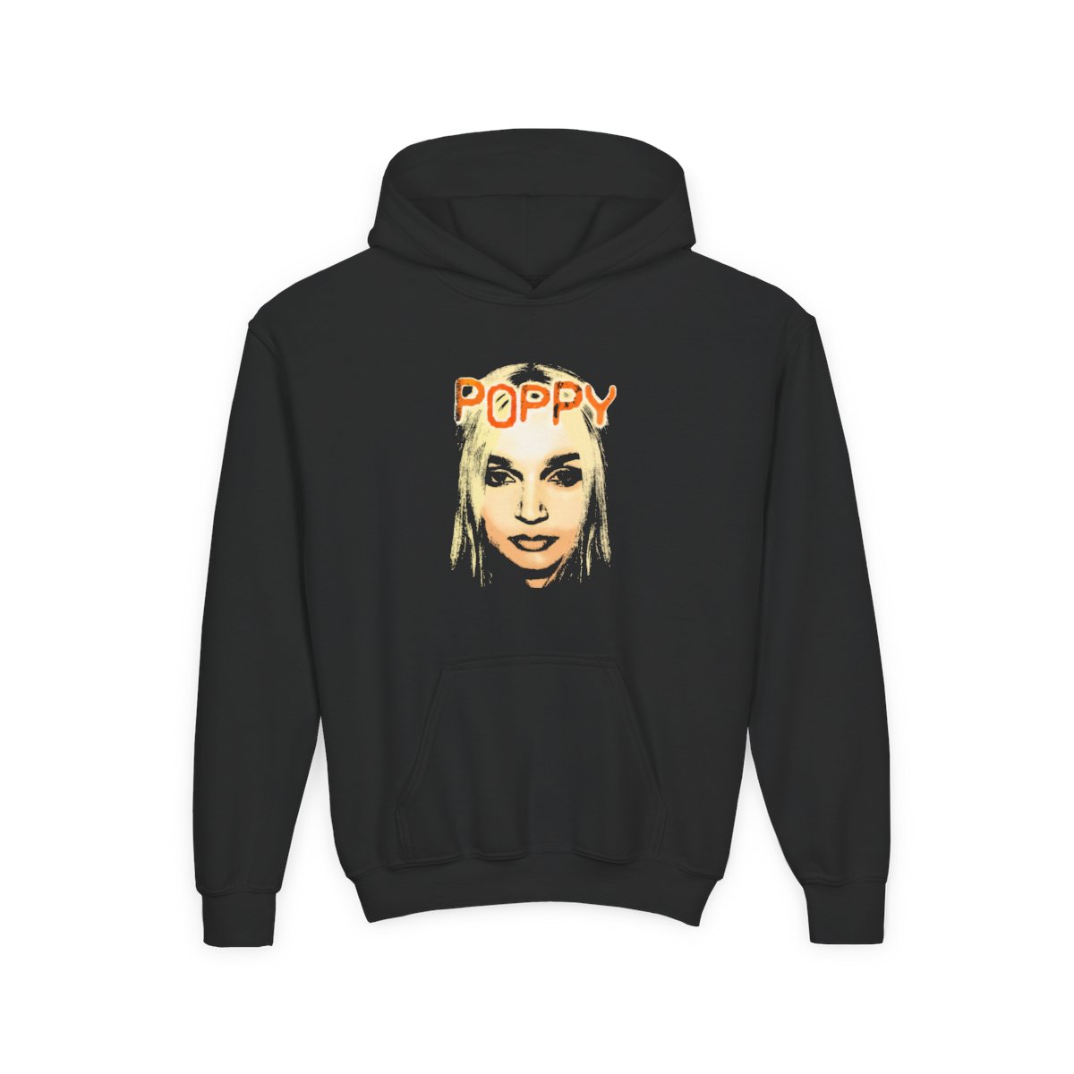
It is the piece for the listener who came in with the metal era and the Grammy nominations: "Bloodmoney" made Poppy the first solo female artist nominated for Best Metal Performance, and "Suffocate" with Knocked Loose was nominated in the same category. The warm orange and red make it one of the brightest back designs in the range, so it stands out on black. The Demons Always Choose Me youth hoodie gives a younger wearer the full back design with a hood to match.
THE END OF YOU: the soft-and-sharp pairing
On the front, a blue flower with green and yellow leaves and a butterfly, with THE END OF YOU in blue. On the back, blue and green butterfly wings sit above the rest of the line: is the start of life for me.
Read together, the two sides turn an ending into a beginning, which is why it makes such a thoughtful gift. Who it suits:
- Someone who loves both sides of Poppy, the pop and the heavy, because the artwork is gentle and the words have a bite.
- Anyone starting something new: a new school, a new city, a new chapter.
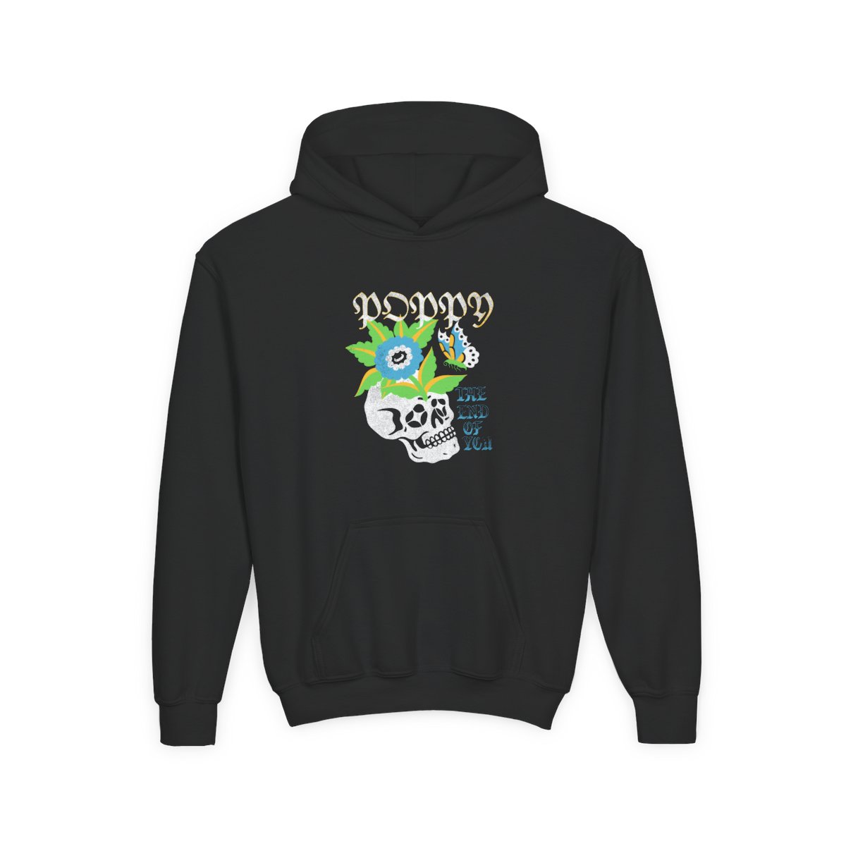
The blues and greens read well on both black and white, and on the The End of You youth hoodie the butterfly wings sit right across the shoulders.
What's the cost of giving up?: the question
The front shows a sword driven through a black flame-shaped Poppy name, with rose stems and roses around it. On the back, the sword and roses return inside a thorny vine frame, around a single question: What's the cost of giving up?
It is the quietest line of the group and maybe the one that stays with people longest. It suits:
- The friend who needs a push to keep going, and would rather get it from a hoodie than a speech.
- Anyone who likes roses-and-thorns imagery without going full graveyard.
Because the front is mostly black, it works best on white, where the sword and roses stand out clearly.
What about the tour pieces?
A few designs carry a different kind of line: the road. Poppy's 2025 tour was called They're All Around Us, after a long run of tours that goes back to the Poppy.Computer Tour in 2017 and includes the Threesome Tour with Bring Me the Horizon in 2019.
- Tour 2025 Dates: They're all around Us in pale blue hand-drawn letters on the back, a TOUR 2025 tag and columns of dates and cities. It is the classic tour-shirt layout, made for anyone who wants to remember the run.
- They're All Around Us Tour: an icy blue face with red eyes and lips behind the outlined POPPY name, the tour named above it, on the front.
- Safety Pin Deer: a big-eyed red fawn with safety pins under POPPY in blackletter, with They're All Around Us along the bottom.
If you were at a show on that tour, or you know someone who was, the dates design is the obvious pick.
Which garment should you pick?
Every one of these designs comes on the full range: tee, long sleeve, crewneck and three-panel hoodie, plus the kids' tee, youth crewneck and youth hoodie. A quick way to decide:
- Hoodie: the best stage for a back design, because the words sit high and wide across the shoulders.
- Crewneck: the same back space, no hood, a bit tidier for everyday.
- Tee: lighter, and the line still reads clearly from behind.
- Kids and youth: the same designs in smaller sizes, each with its own size chart on the product page.
Pick the line that sounds most like the person who will wear it, and let the back do the talking.